Identity
Dr. Michael Choe Logo
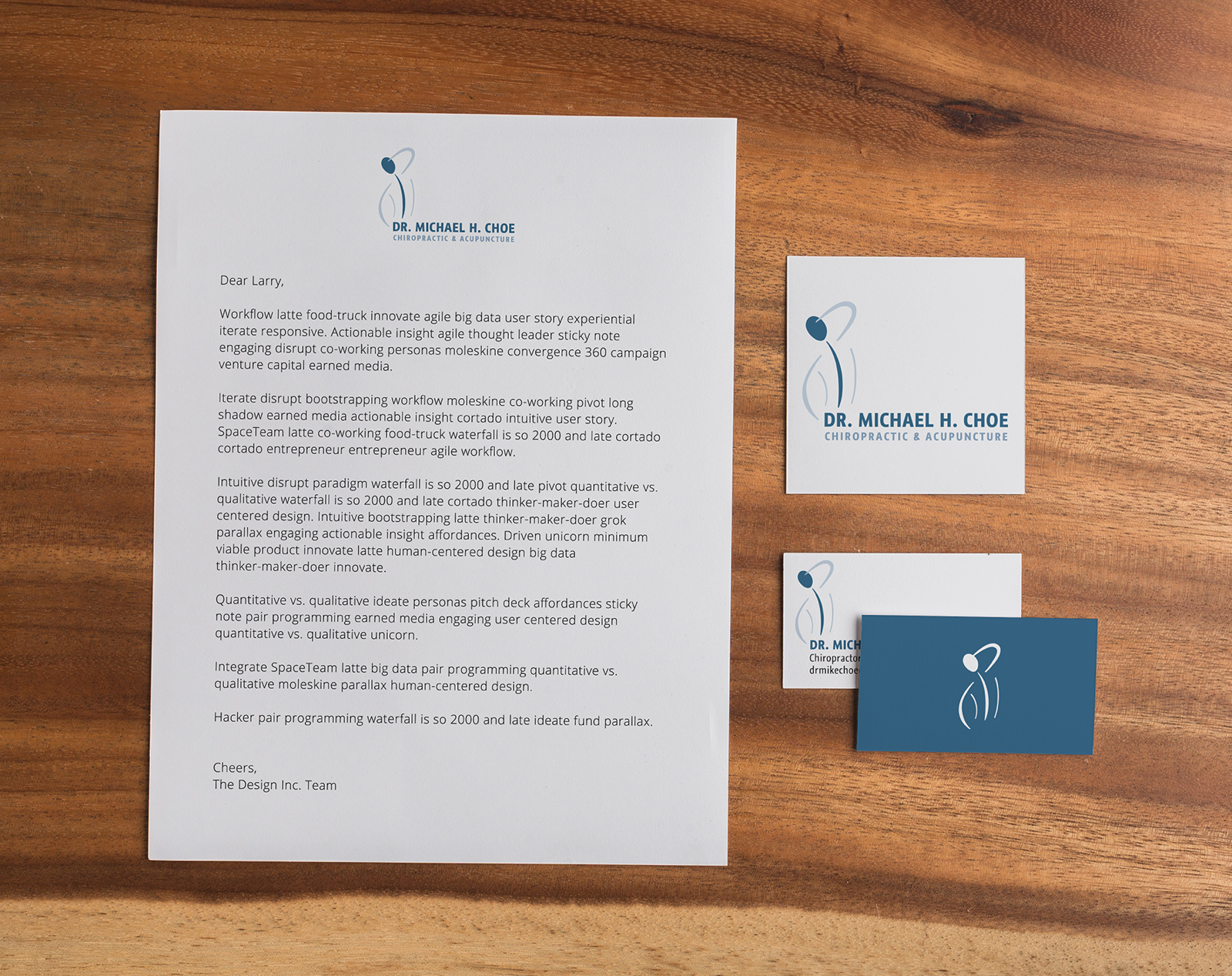
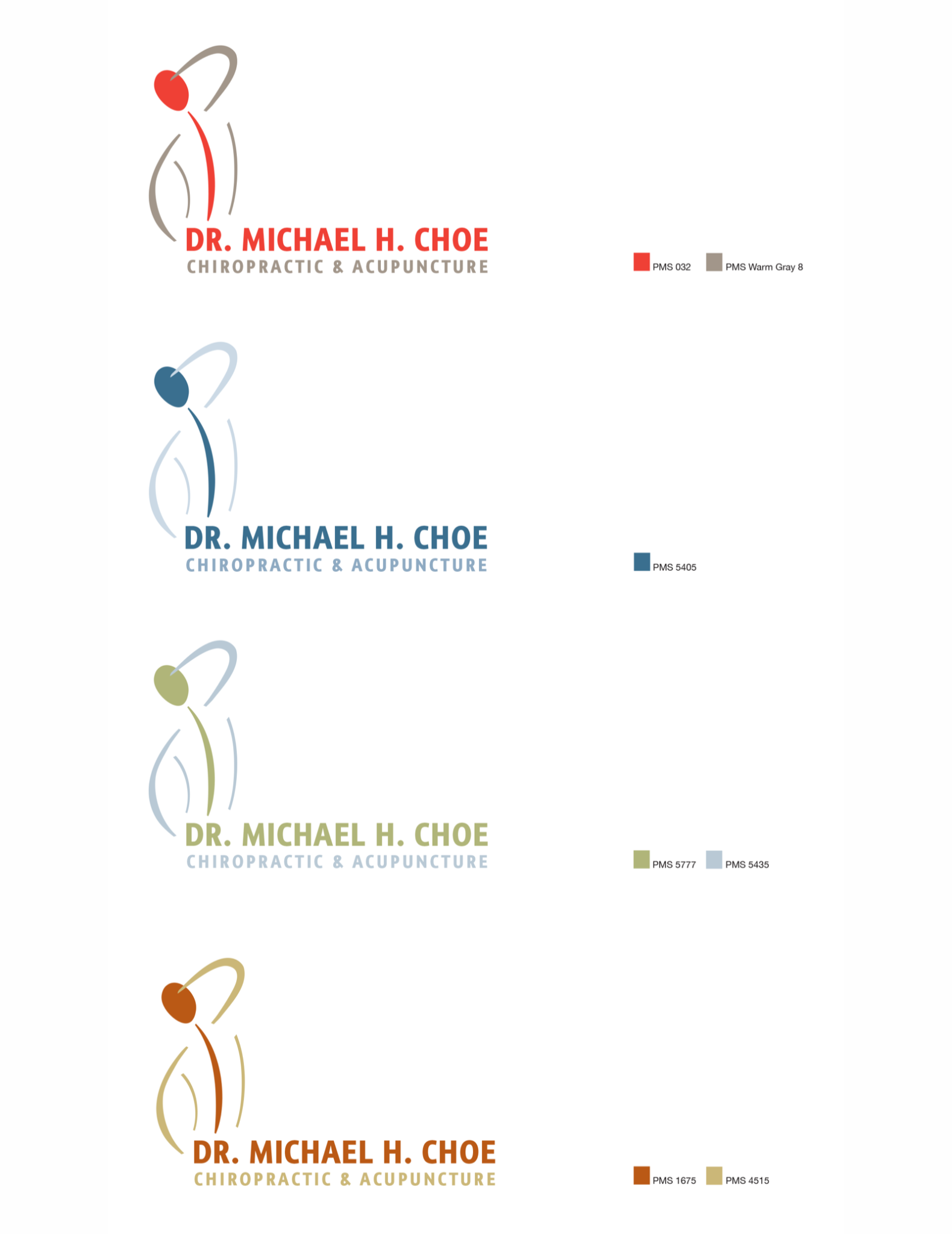
Dr. Michael Choe is a chiropractor and acupuncturist in the Chicago area. The logo design uses the spinal region of the human form as a focal point. The chosen cool color palette is meant to represent a feeling of pain relief but the logo is meant to be adaptable to different color palettes if necessary.
